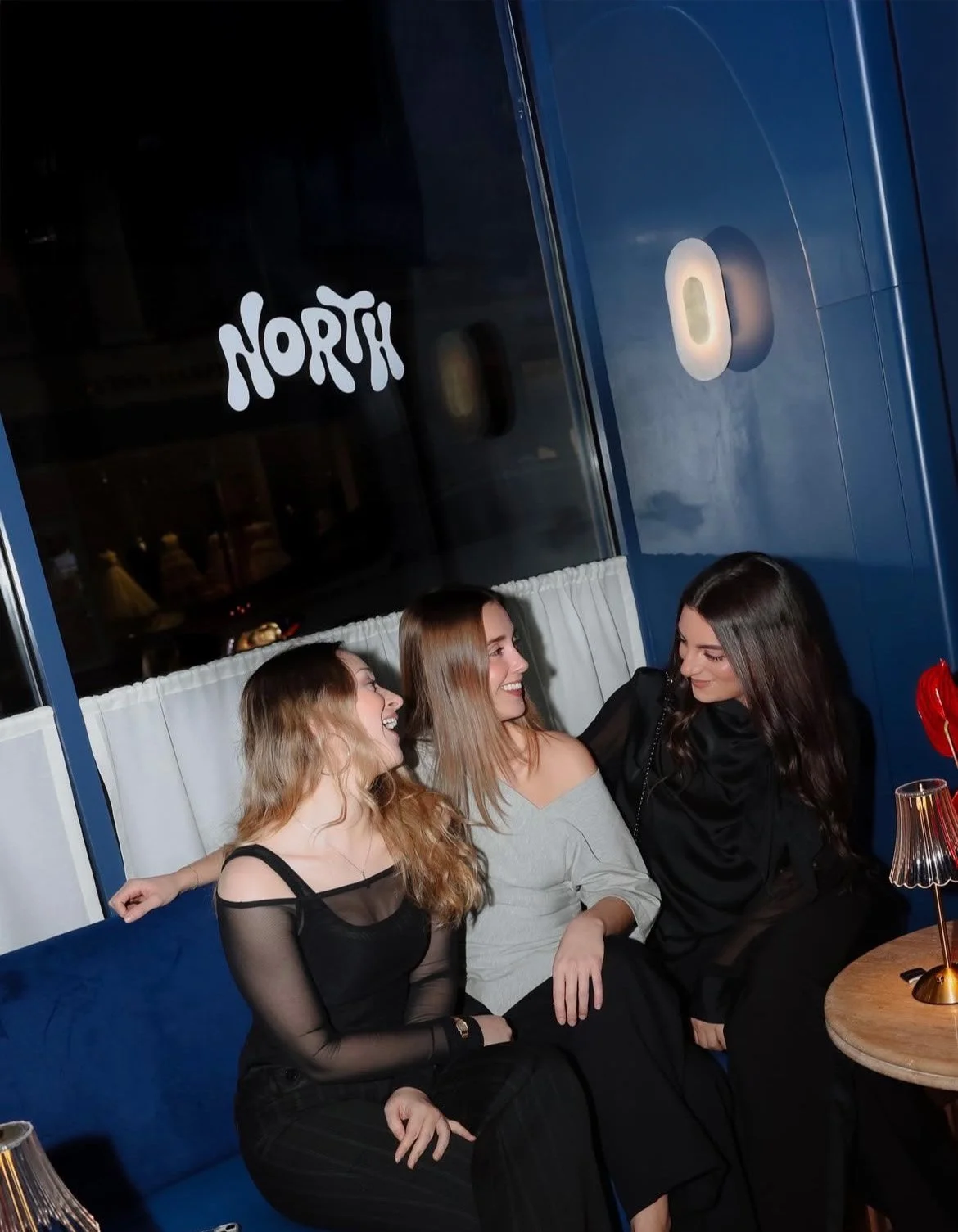
North Agency: Beauty industry becoming something bigger.
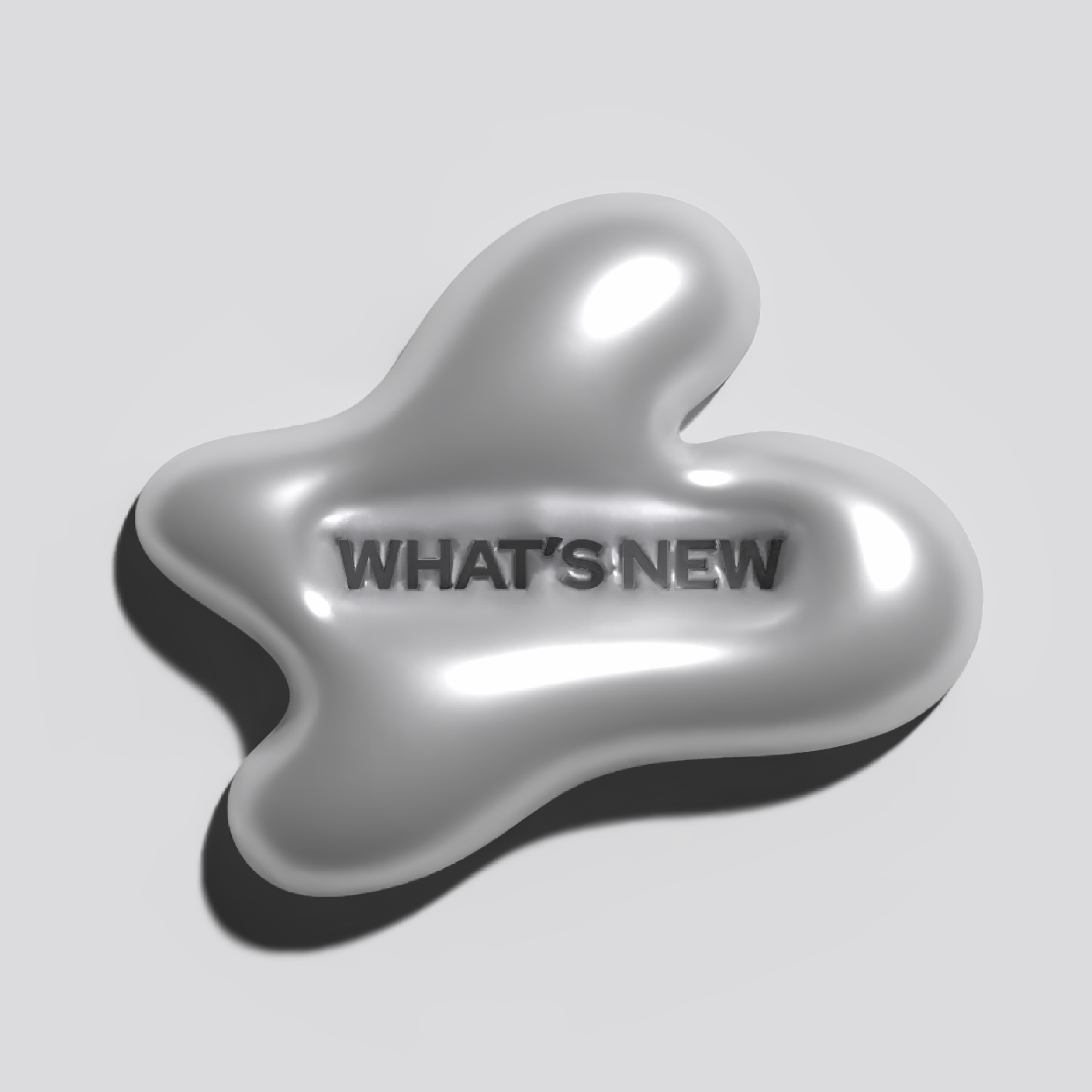
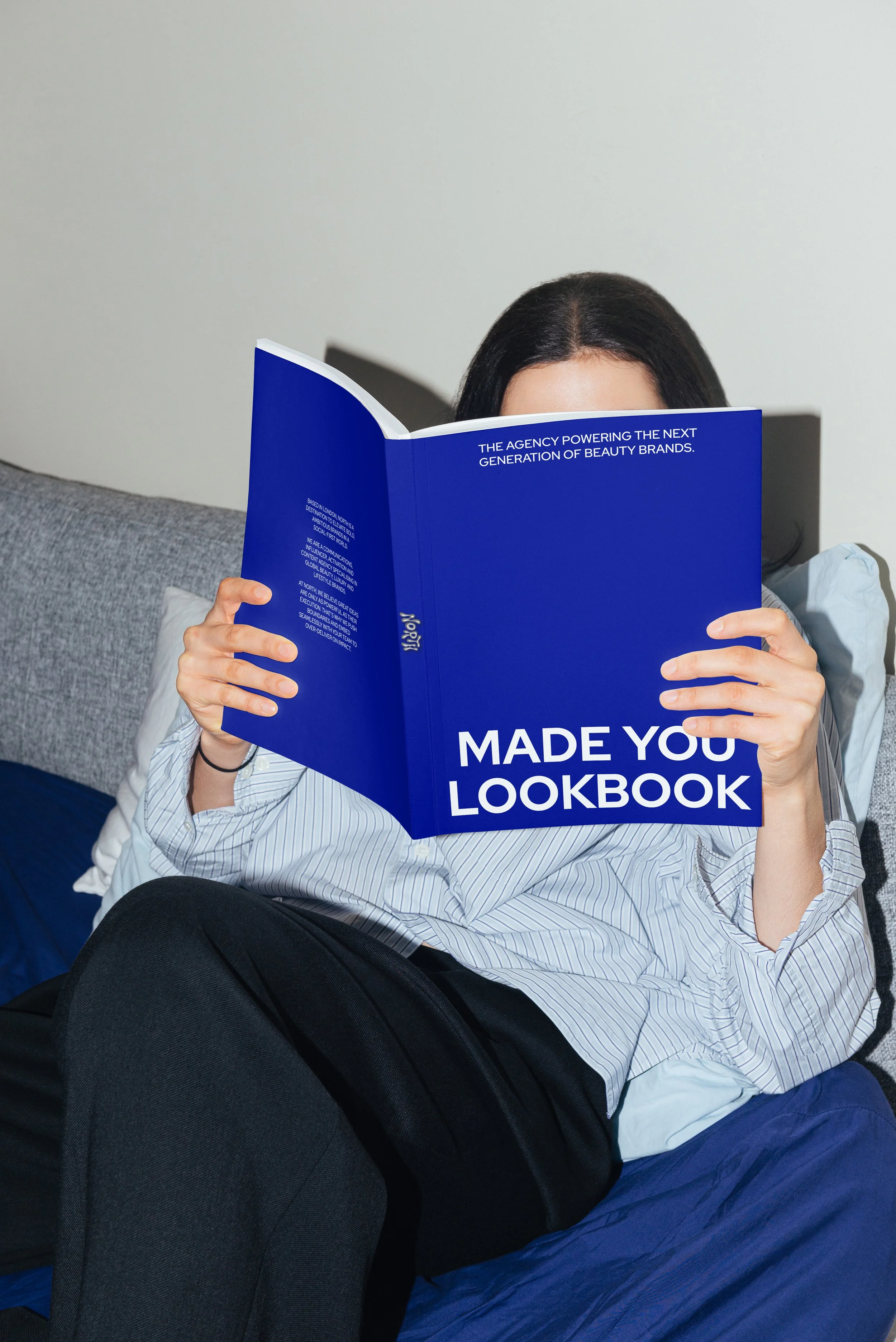
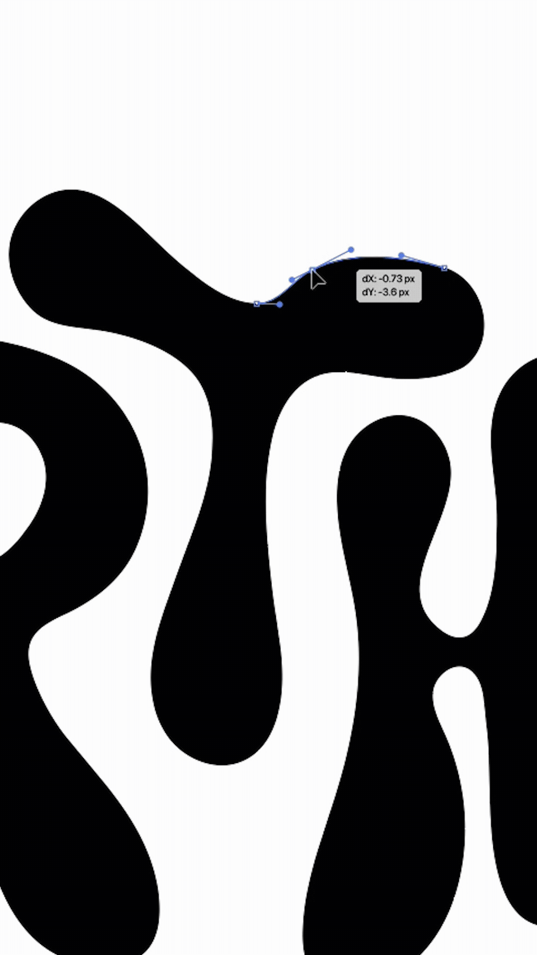
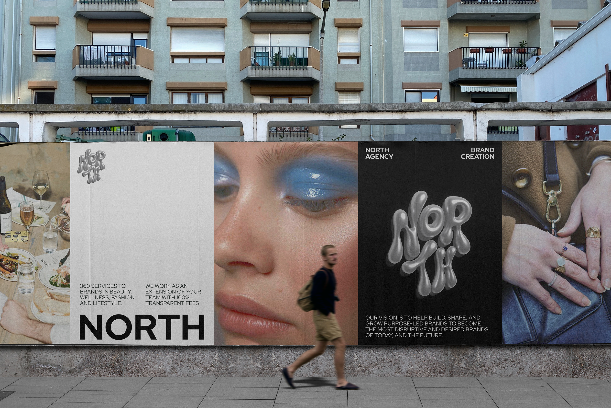
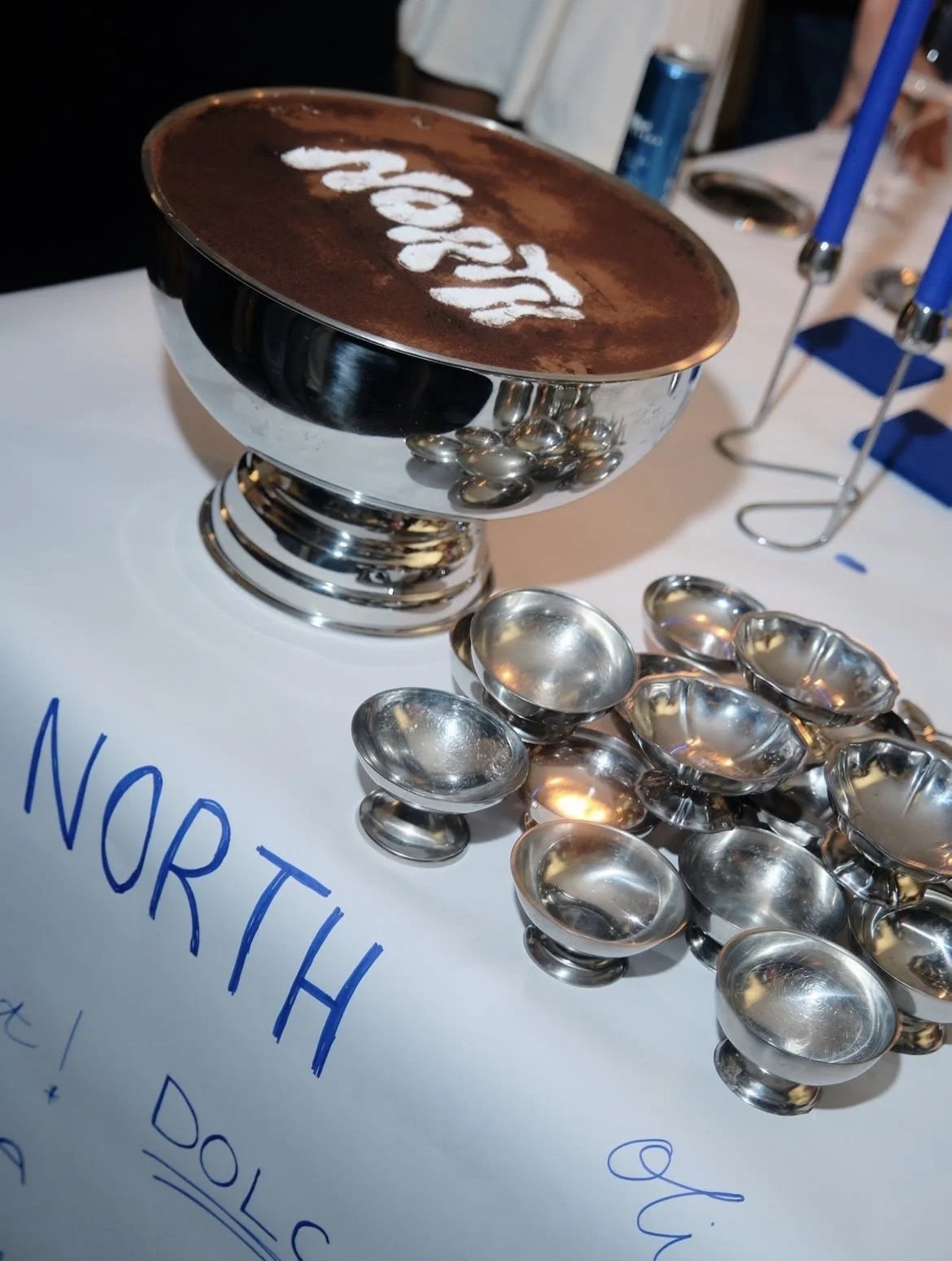
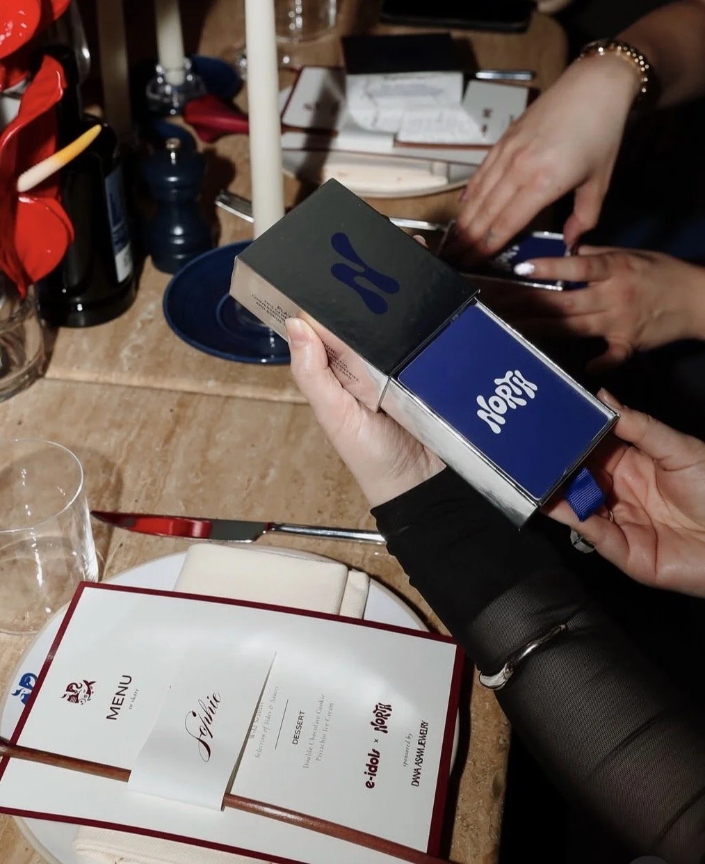
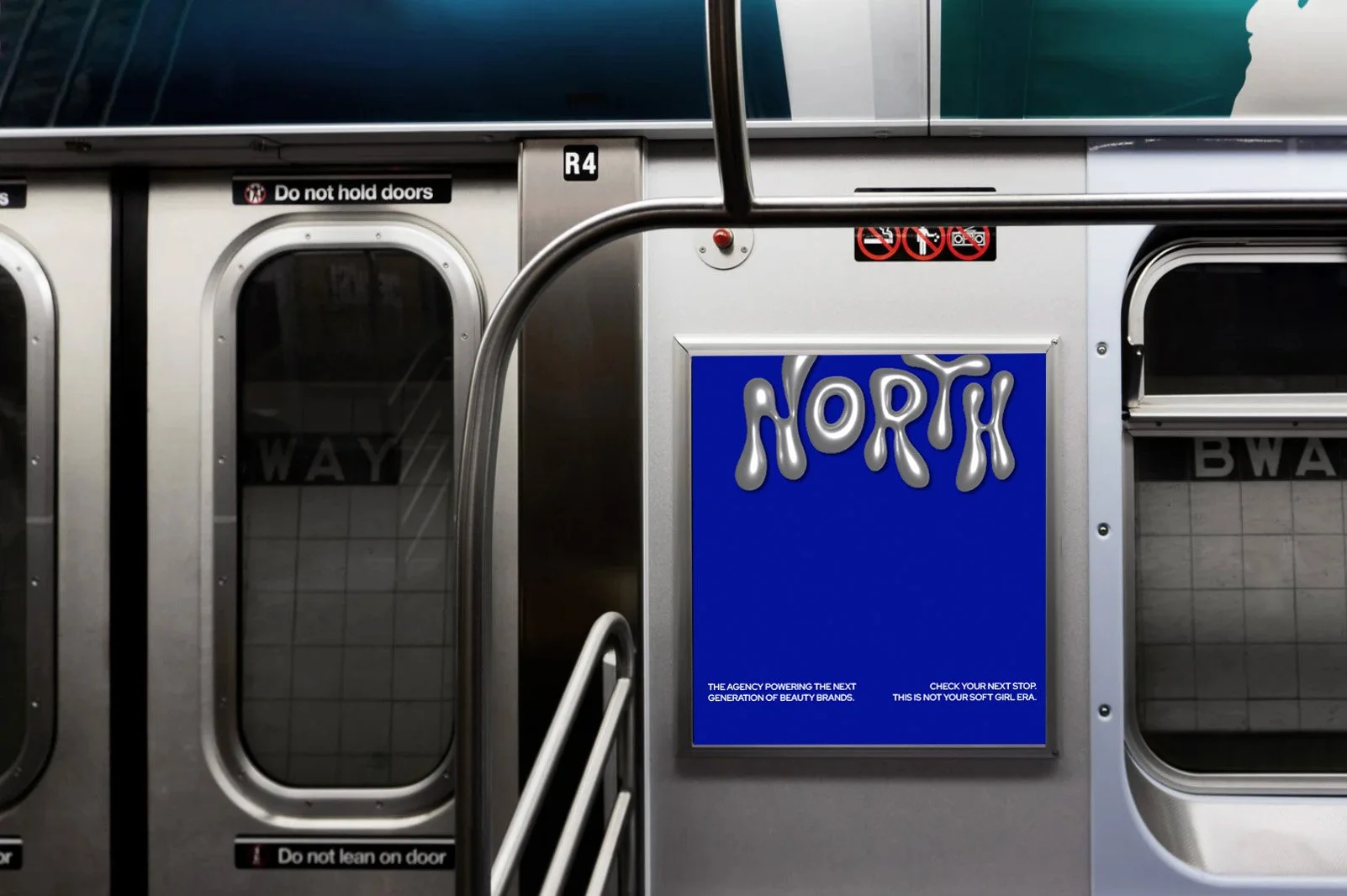
Avoiding the overly feminine vision of women in beauty brands, we wanted tochallenge usual 'pretty' with a more masculine colour palette leading with silver often associated with industrial environments crossed over with the fluid shapes seen in the beauty industry. Metallic and moving, the branding aimed to capsulatet he new era of corporate city girls.
Developing experimental typography with a mixture of simple sans fonts with acustom designed 3D logo to show their modern and forward thinking approach.All highlighted with a royal blue to create confident and eye catching visuals.
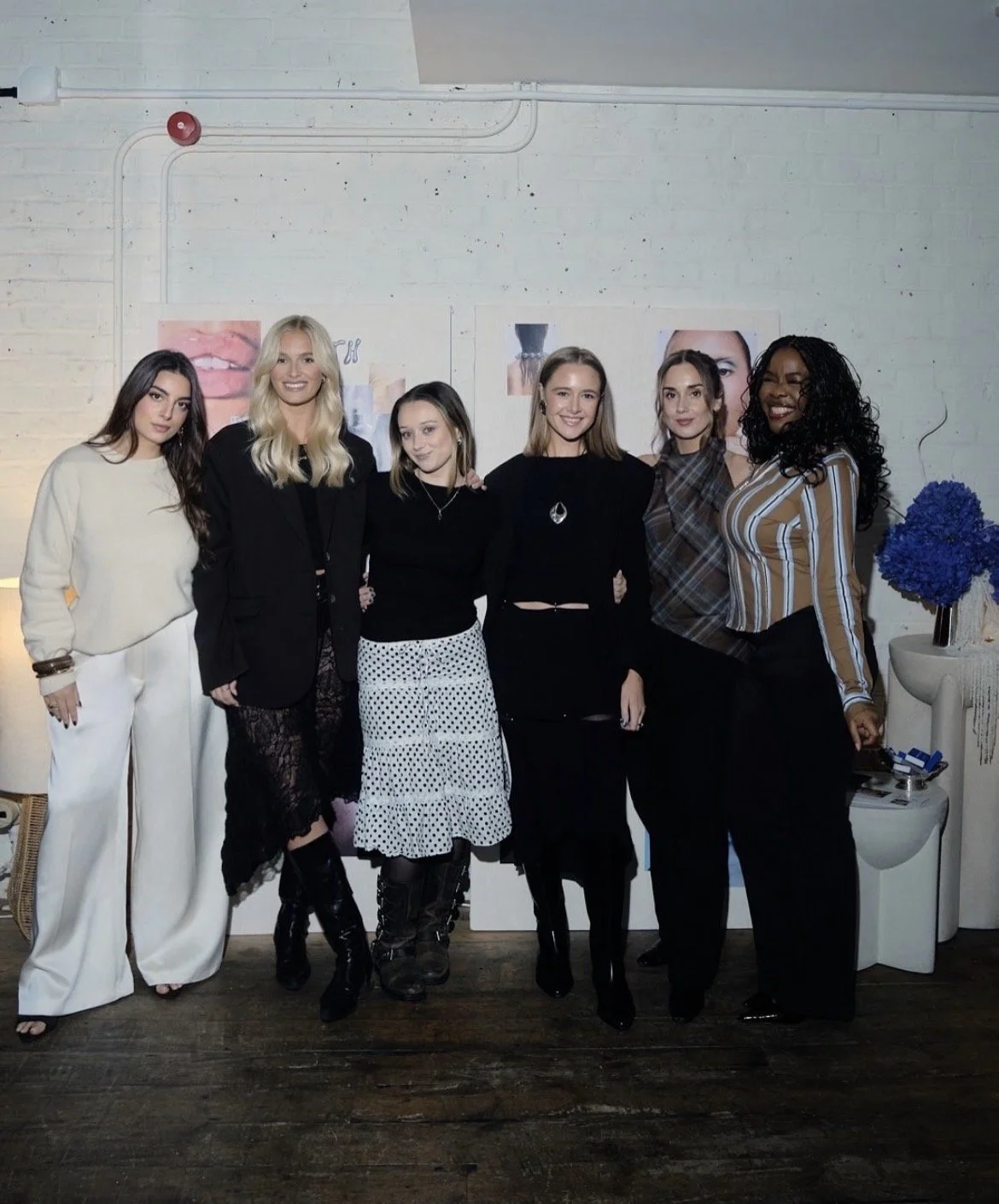
Working with Kosas, CeraVe, La Roche Posay, Sundae Body & Sephora
Role: Design Lead
Services/Role: Brand Identity, Visual Systems & Social Media Content Design
Team: North Agency