Bring back Beautiful Fonts
My first experience of spending hours to find the right font was in IT class discovering Powerpoint and WordArt. Surely, this was every Designers gateway to graphics?
From the option of 20 questionable textured and rainbow fonts, to today, we have access to thousands of fonts at our fingertips — yet somehow it feels harder than ever to find one that feels right. And while digital platforms have only expanded our choices, many brands seem to be looking backwards instead of forwards.
Noctibly, the art of lettering and calligraphy is making a major comeback at the centre of modern marketing. From Hollywood films, to music tours and even Waitrose adverts, we’re seeing a resurge of handwritten and calligraphy.
Moving far from the chokehold Helvetica has had on adverts since the start of the 2000’s. We’re seeing the beauty of “forgotten fonts” (ornamental scripts, vintage serifs, classic calligraphy) returning to the spotlight.
Notably some of favourites have been:
The striking, lacy typography in bright yellow took centre stage for the upcoming Wuthering Heights film (2026), was custom-designed by CHIPS Studio.
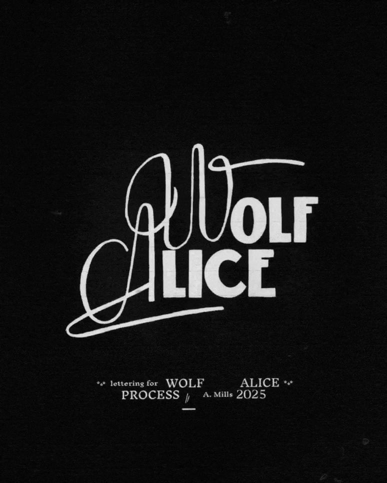
Wolf Alice’s Allbum Artowrk (2025) custom typography designed by Anna Mills seen in her signature style of wonderfully wonky letters and hand textures.
Waitrose Winter/Christmas Campaign ‘The Perfect Gift’ (2025) created by Wonderhood Studio bringing a romanic typeface to set the scene for the campaign.


Ready for the Revival
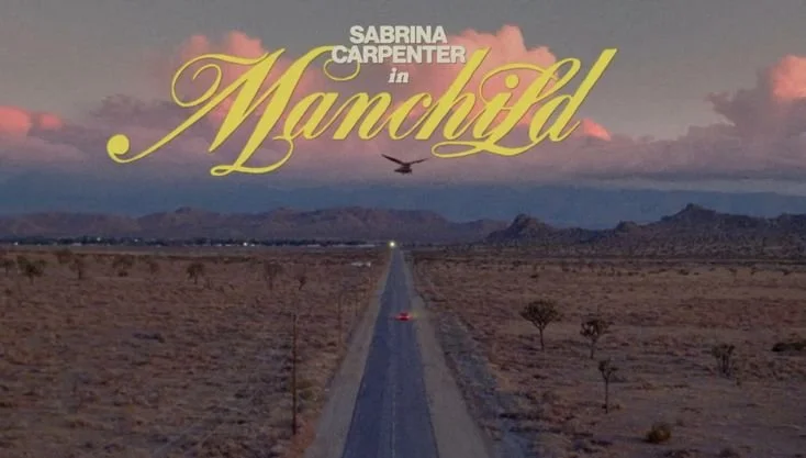
In the past year or so 4 of the biggest artists (Sabrina Carpenter, Olivia Dean, Billie Eilish and Raye) have release music and all used some form of vintage script, calligraphy style or more specifically cinematic nostalgia. This refers to fonts designed to look like classic film title cards from the 1940s–1970s which include:
hand-lettered scripts
flourished capitals
engraved-style serifs
dramatic ligatures
shadowing, embossing
At the heart of this shift is a desire for emotion, these styles carry a softness and sentimentality that digital minimalism could never hold. This links to how we’ve always seen artists position their music videos as tiny films and most importantly, it restores a sense of storytelling to a medium that has increasingly been reduced to algorithmic thumbnails.


The Fall and Rise of Typography
This is a major shift in style. Since the early 2000’s every major rebrand seemed to strip away its quirks in pursuit of becoming universally “modern.” Helvetica, Gotham, Futura became the holy trinity of neutrality and the default language of branding.
This trend obviously is married to technology, as tech giants grew, so did their design philosophies. Google and Apple followed countless startups leaned heavily into clean typography as it meant meant efficiency, trust, and clarity and soon every industry wanted to look just as sleek. Now with the rise of AI you’d think that this trend would continue.
Typography has always moved in cycles, but why this is so important now is that the past two decades have been focussed on minimalism and now people want more.


A New Golden Age for Typography
Recently as a designer I’ve been getting more requests of hybrid typography systems. Where as before we’d only suggest a brand to use 2 fonts for consistency, I’m expect more brands will adopt “type palettes” (like color palettes) , combining a custom or vintage-inspired header type, a clean modern body type, and maybe even a handwriting or script for accent. This gives flexibility: heritage + readability + personality.
My hot take! Fonts are becoming as important as photography or illustration in visual storytelling.
Just as a powerful photograph sets mood, a vintage or hand-lettered typeface can evoke era, emotion, values often before a viewer reads a word. As viewers grow overloaded with content, the designs that stand out are those that feel “real,” “crafted,” or “nostalgic” and typography is a powerful tool to achieve that.